This is the intro for the documentary dedicated to "Great Dragon" - the first ever gaming magazine in Russia. It was adored by every kid who grew up in 90s. Being one of those kids and looking at all these covers at the time I always wondered how'd they look if they could move. 25 years later, thanks to this documentary, this little dream came true. Now the header has even more meaning - it is bringing back the childhood and making these memories look even more alive that you remembered, making it look like you always thought they were in your mind.
The documentary: https://www.youtube.com/watch?v=aBwyUIp6UJo&t=30s
The documentary: https://www.youtube.com/watch?v=aBwyUIp6UJo&t=30s
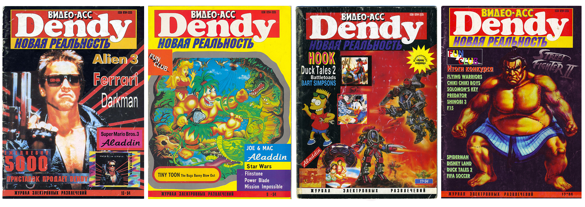
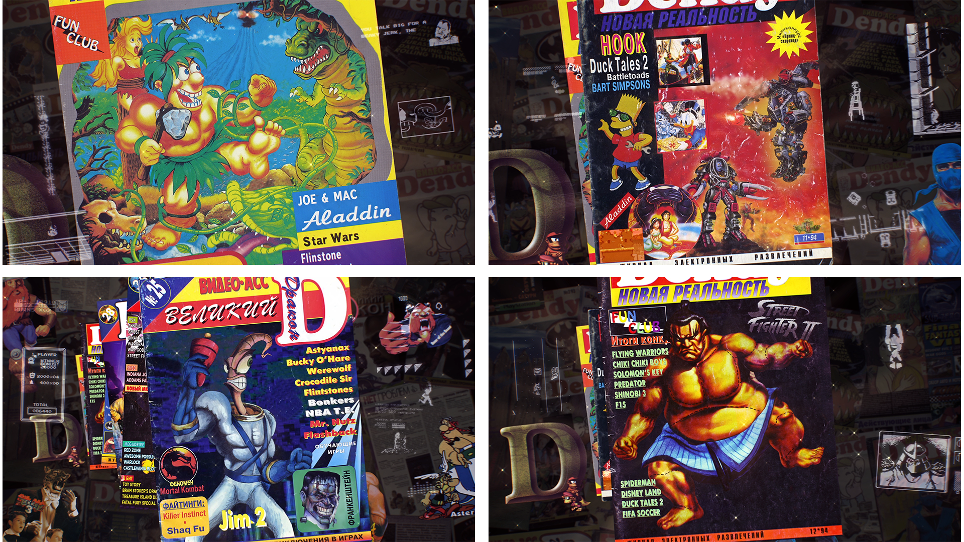
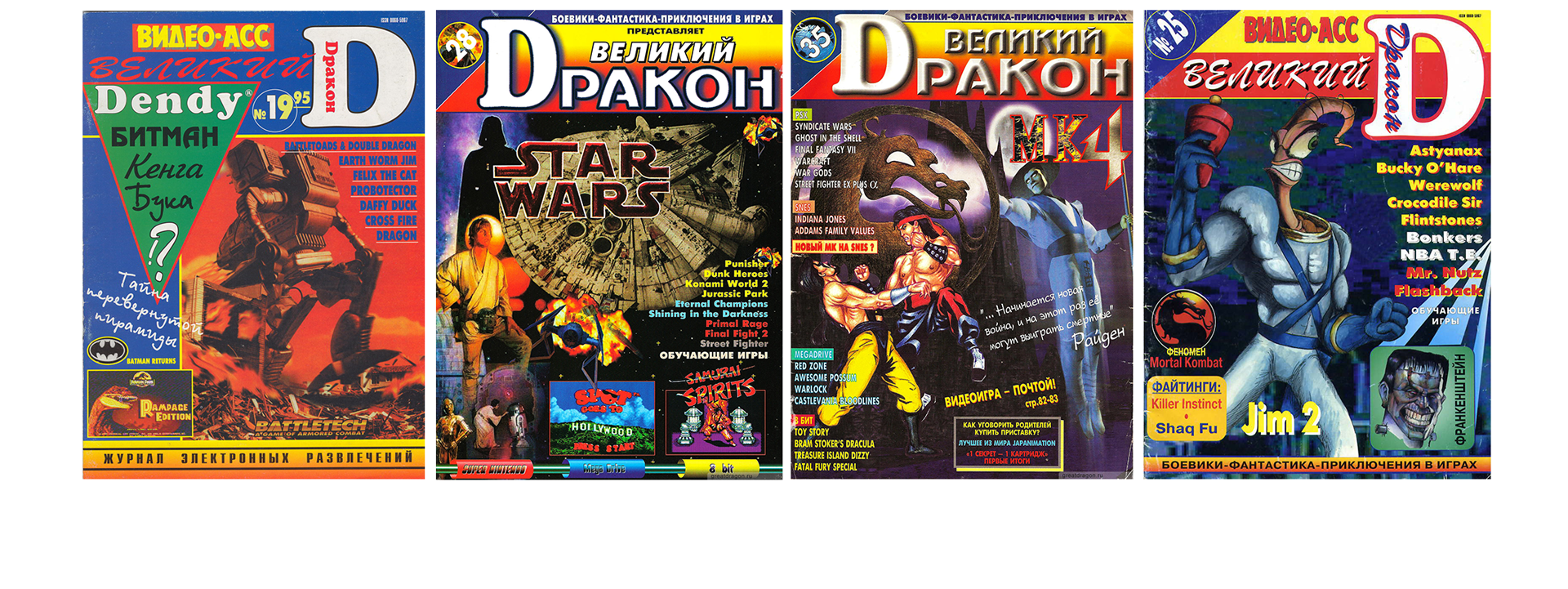
These are the covers that were used in the header (I didn't create them). I think they're so warm, so awesome and cheesy. And that defined the style of animation. The main principle in animating was "what could move, should move" and it also should have this warm memory feel (and the cheesiness!). In some cases it was just about animating the characters and replacing some still frames with moving 3d models. Others required more geeky approach like replacing the screenshots from games and VHS-quality movies used on the covers with actual game and VHS-quality movie footage.
The idea, art direction, animation, sound design are by me (I also wrote that tune).
Thank you for reading this, that's my favourite project to date!